
14 Feb 2025
Your corporate identity is your brand’s visual soul — everything from your logo and typography to color palette and brand collateral. A mockup gives life to these elements, showing how they feel in real-world use. In this article, we explore how to design effective corporate identity mockups that help clients visualize their brand with confidence.
1. What Is a Corporate Identity Mockup?
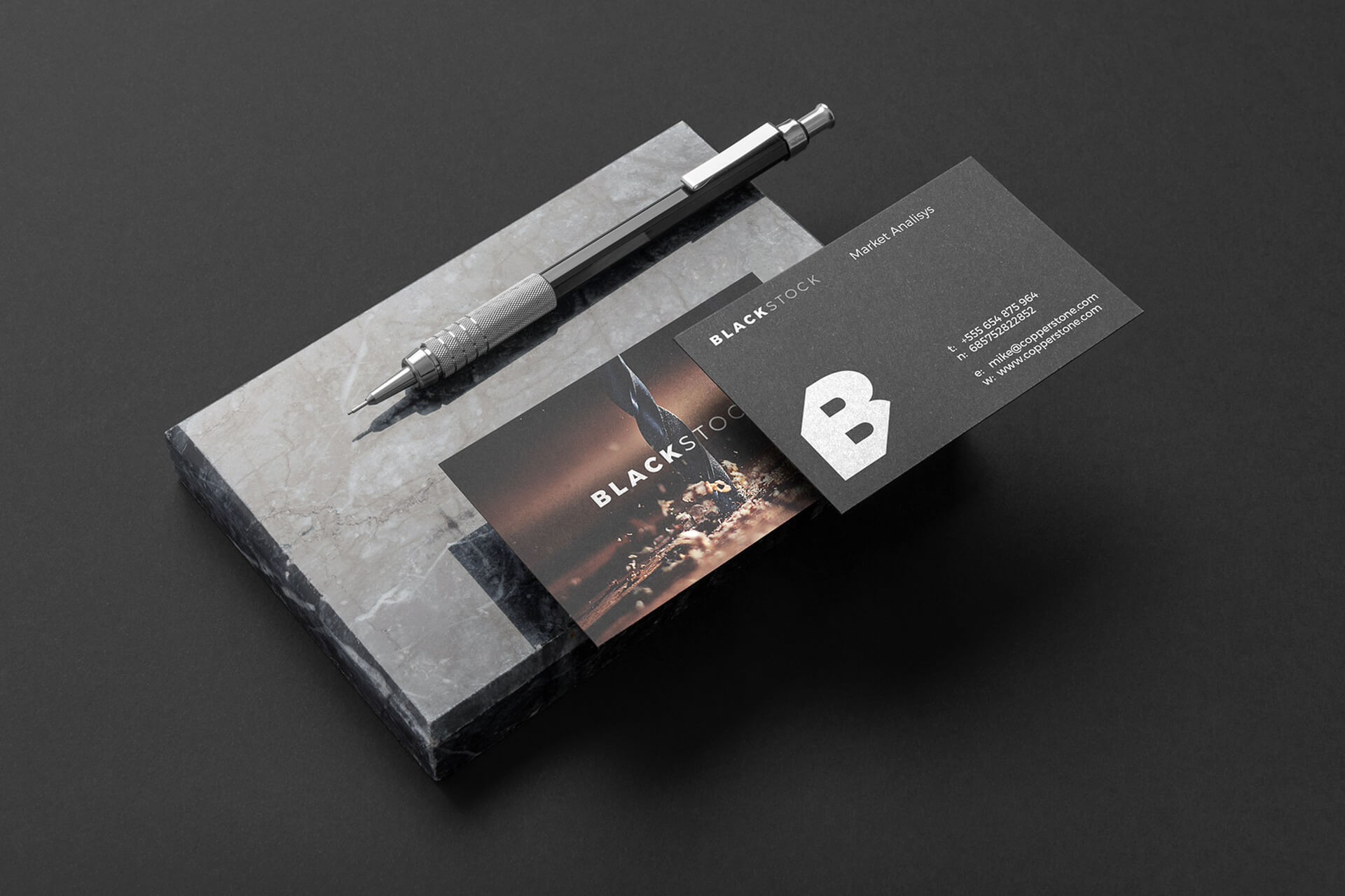
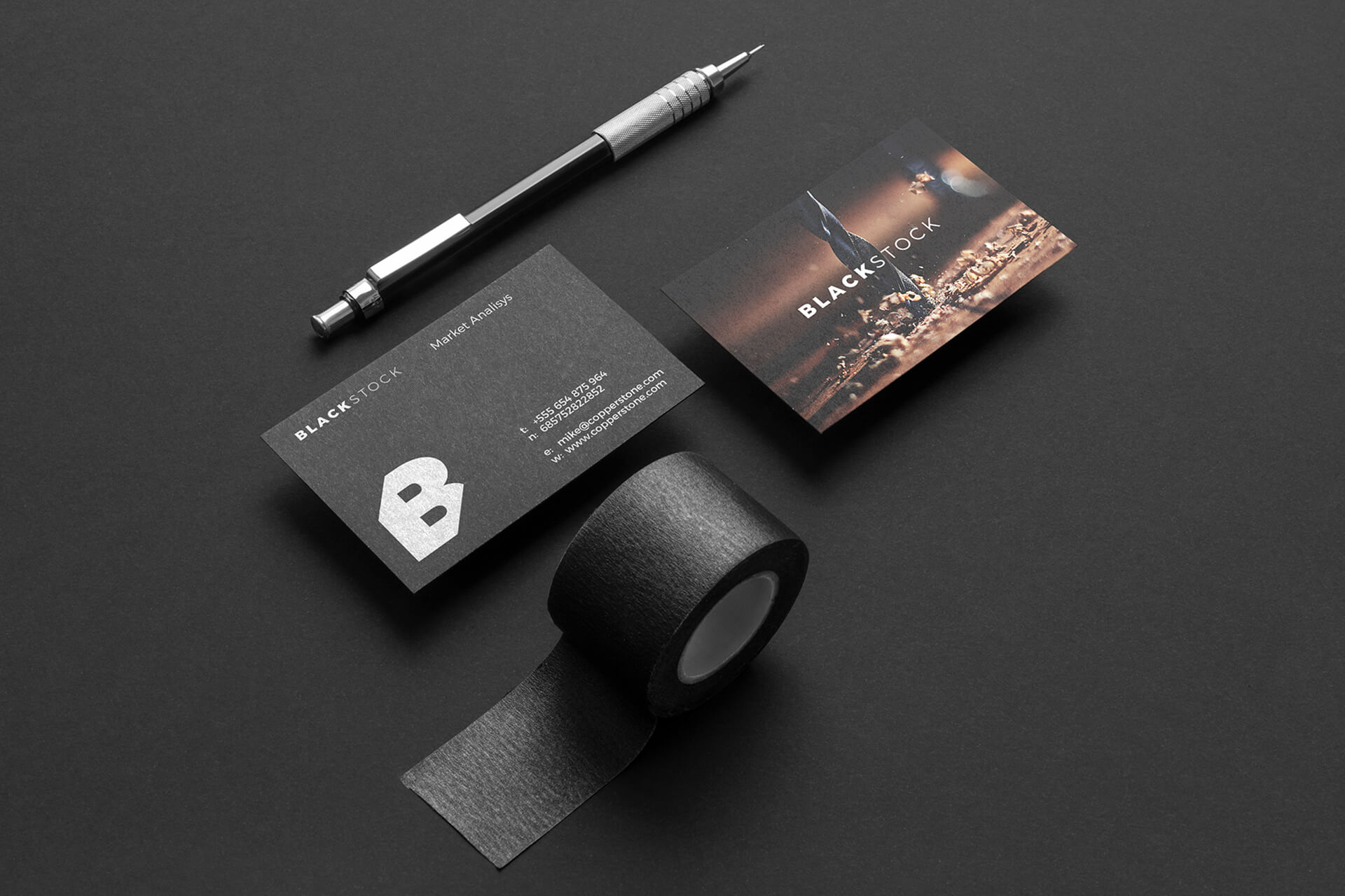
A corporate identity mockup is a visual tool designers use to present a brand’s identity in context — for example, on business cards, letterheads, signage, packaging, or digital screens. It bridges the gap between abstract branding elements and real-world usage.
Mockups not only make your presentation more professional; they help clients see what the logo and design system will feel like in use.
2. Why Corporate Identity Mockups Matter
-
Visualization & Buy-In: Clients can better imagine their brand when they see it on physical items (stationery, signage) or on screens.
-
Consistency Check: You can test color, scale, placement across different media.
-
Marketing & Portfolio: A mockup becomes part of your portfolio and marketing visuals.
-
Client Confidence: Seeing their brand “in real life” reduces revision rounds and builds trust.
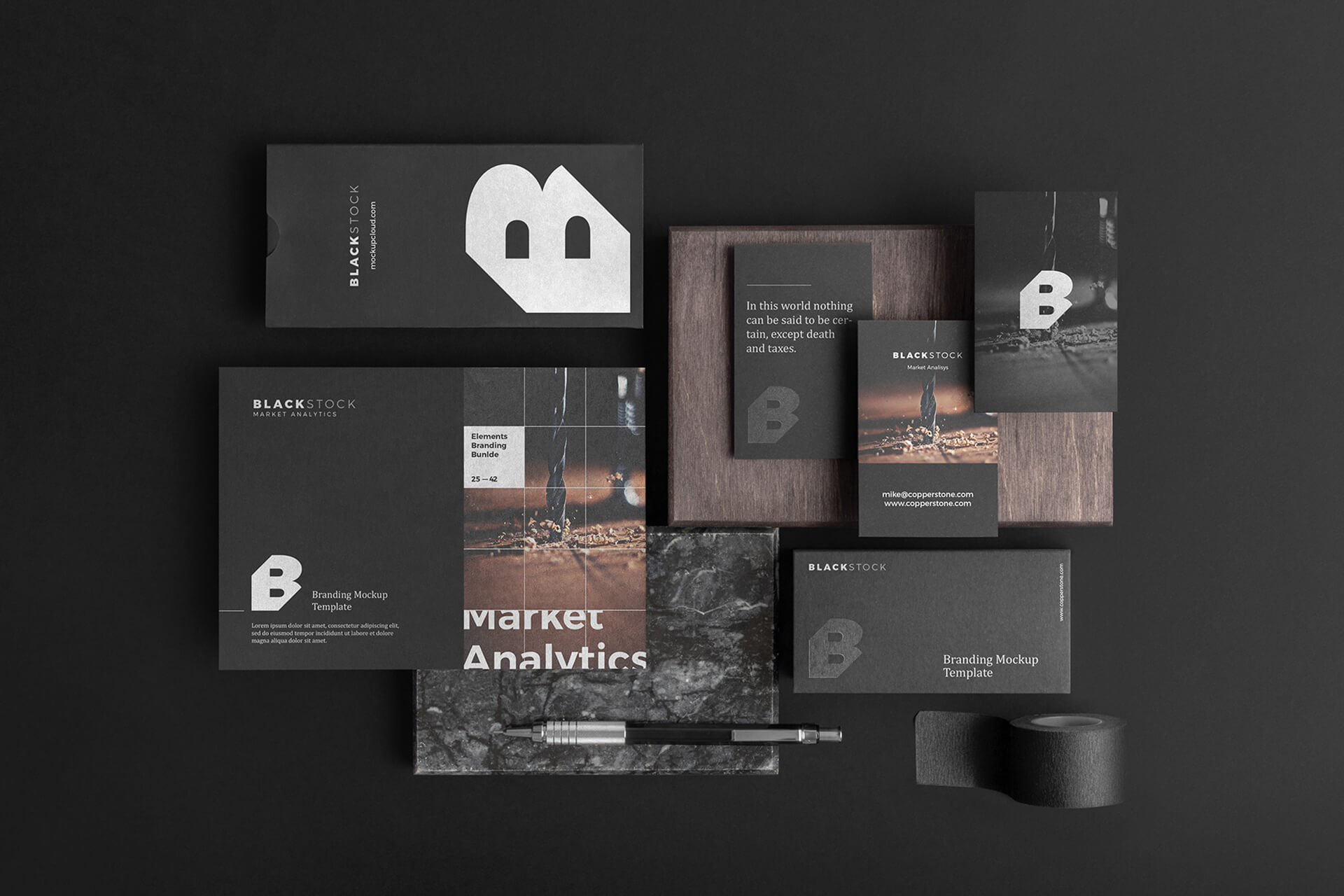
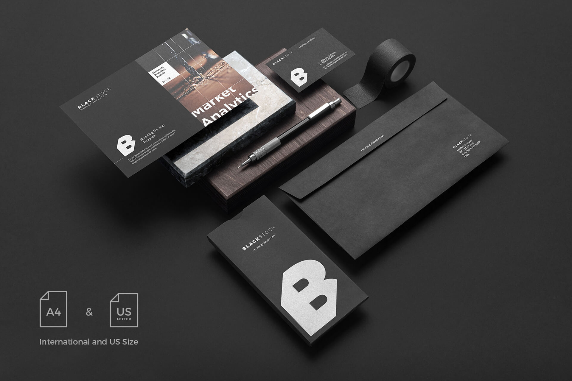
3. Key Components of a Strong Mockup
| Component | Intent / Role |
|---|---|
| Logo in context | Logo on letterhead, signage, apparel, mobile screen, etc. |
| Typography | Body text, headings, captions, and hierarchy |
| Color palette | Primary, secondary, accent colors applied to surfaces |
| Brand assets | Icons, patterns, textures, photography |
| Layouts & grids | Spatial rules and margins to maintain consistency |
| Application range | Business card, envelope, app screen, social media post |
4. Tools & Software for Corporate Identity Mockups
-
Adobe Photoshop / Illustrator: classic for layered, editable mockups
-
Figma / Sketch: vector-based, collaborative UI mockups
-
Placeit / Smartmockups: fast, ready-made mockup generators
-
Mockup templates: purchase or find free PSD mockups for stationery, digital devices, packaging
Use high-resolution mockups and ensure shadows and lighting are realistic.
5. Step-by-Step: How to Create a Corporate Identity Mockup
-
Prepare your brand assets (logo variants, color codes, fonts, icons)
-
Choose mockup templates relevant to the client’s industry (stationery, signage, digital screens)
-
Place the logo and elements in smart objects (in Photoshop) or frames (in Figma)
-
Apply color variations to background, foreground, accent surfaces
-
Add textures, shadows, emboss effects as needed — subtly, not over the top
-
Compile multiple applications side by side (letterhead, business card, app screen)
-
Export high resolution (300 dpi for print, 72 dpi for web)
7. Common Mistakes & How to Avoid Them
-
Overcomplicating mockups — stick to a few strong applications.
-
Wrong colors or mismatched elements — always check brand specs.
-
Low resolution images — use clean, high-res templates.
-
Ignoring consistency — grid, spacing, and proportion matter across all mockups.
-
Lack of context — show real-world use, not floating logos.
Conclusion
A corporate identity mockup is more than a showcase — it’s a bridge between concept and reality. When done well, it communicates brand strength, reduces revisions, and gives clients clarity. Use the steps and tips in this guide to build mockups that win confidence and elevate your brand portfolio.
Marcella Leonard 14 May 2025
Lorem ultricies nibh non dolor maximus sceleue inte drana on molisen faubs neque nec tincidunte aliquam eraten volume lectusion finibus in the miss rana duru fermen.